 Oko Dot All In One Technology Solutions By Likhon Hussain
You’re a data analyst who dreams in visualizations. Bar charts, pie charts, scatter plots – you name it, you love it. But your true passion is finding the perfect programming language to bring those vibrant graphs to life. You want something intuitive yet powerful.
Easy to use but capable of crunching terabytes of data. A language with built-in visualization libraries so you can focus on insights instead of infrastructure. My friend, your search is over. In this article, I’ll introduce you to five programming languages that data analysts simply adore in 2024. From the statistical powerhouse R to the scalability of Scala, you’ll find your new data visualization BFF.
Don’t worry, I’ll skip the boring technical details. My goal is to give you the highlights so you can start doing what you do best – making data dazzle and delight. So plug in your laptop and get ready to fall in love with your next go-to language for interactive, dynamic, and downright gorgeous data visualizations.
01. R Programming: A Statistical Powerhouse for Data Visualization
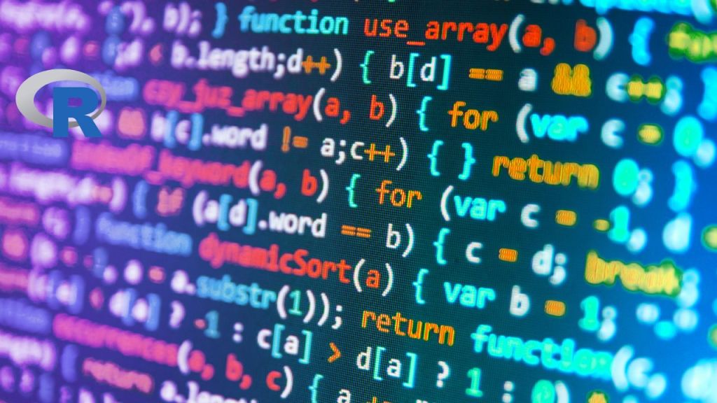
If you’re a data analyst looking to visualize your findings, you can’t go wrong with R. This open-source programming language was built by statisticians, for statisticians. What does that mean for you? An intuitive interface, thousands of specialized packages at your fingertips, and interactive visuals that will make your colleagues weep with joy.
R’s learning curve is gentle enough that you’ll be up and running in no time. Within a day or two, you’ll be generating histograms, scatterplots, boxplots, and more. As your skills improve, you’ll have access to cutting-edge packages for interactive web graphics, mapping, network analysis, and whatever else your heart desires.
The best part? R’s visualization capabilities are highly customizable. Don’t like the default color scheme? Change it. Want to tweak the axis labels? Go for it. R gives you full control over the look and feel of your graphics. And with its reactive, interactive notebooks, changes render instantly so you can explore different options on the fly.
While R may lack the scalability of Python or Java, its visualization power is unparalleled. For exploratory data analysis and crafting compelling data stories, R is hands-down the best tool for the job. The statistics and data science community have poured their hearts and souls into this language, and the stunning visuals you can create reflect that.
So if you’re ready to make data visualization an art form, dive into the R universe. Your colleagues will shower you with praise once they see what this statistical powerhouse can do. And you’ll feel right at home with a programming language made by data geeks, for data geeks.
02. Scala: Scalability and Concurrency for Big Data Visualization

If you’re a data analyst with a bit of a rebellious streak, Scala might just be your jam. This hipster language lets you visualize your data with a decent dose of snark.
Scala’s main claim to fame is how it handles concurrency and parallelism. With Scala, you can spin up threads and divide tasks among them with ease. For visualizing massive data sets, this means quick work. While your data-crunching friends are waiting for their Python scripts to finish running, you’ll already be kicking back with a cold one, your visualizations complete.
Interactive and Zoomable
Scala utilizes powerful libraries like D3.js that make interactive and zoomable visualizations a cinch. With a few lines of Scala code, you’ll have scrollable, zoomable maps, graphs, and charts. Your stakeholders will ooh and ahh as you zoom from a global view into a single data point with the click of a mouse.
Scalable
Scala was built for scale. Whether you have terabytes or petabytes of data, Scala can handle it with composure. As your data grows, your visualizations will continue to perform, giving you insights into massive data sets in a flash. No more waiting overnight for your scripts to run – with Scala, you get speed and scalability in one slick package.
A Bit Quirky
Scala’s not without its quirks, however. The syntax can seem bizarre to those coming from other languages. Scala blends object-oriented and functional styles in ways that can confuse newcomers. However, once you get past the learning curve, you’ll have a powerful, concise language for crafting stunning data visualizations.
While not the most mainstream language, Scala deserves consideration by any data analyst looking to gain valuable insights from the largest data sets. Its power, scalability, and interactive capabilities make it ideal for crafting robust data visualizations quickly and efficiently. So next time you have a mountain of data to visualize, give Scala a spin – your rebellious side will thank you.
03. Python: Versatility and Community Support for Data Science

Python is the cool kid on the programming block these days. With a simple, readable syntax and a huge library of pre-built functions, Python lets you get up and running fast with data analysis and visualization.
Easy to Learn, Hard to Master
Python has a shallow learning curve, so you can start coding and seeing results quickly. But it also has enough depth and complexity to keep things interesting for data science pros. The simple syntax and intuitiveness of Python belie its power and flexibility.
A Library for Every Task
Whatever data wrangling or visualization task you need to perform, chances are there’s a Python library for that. From industry standards like NumPy, SciPy, and Pandas to interactive visualization with Plotly and Bokeh, Python has you covered. These libraries are constantly updated by an active open-source community, so you’ll always have access to the latest data science tools.
Jupyter Notebooks: Data Science Magic
If you’re a data analyst, you need a tool where you can seamlessly combine code, results, visualizations, and documentation all in one place. Enter the Jupyter Notebook. The Jupyter project lets you create and share interactive notebooks that contain live code, equations, visualizations, and narrative text. Originally created for Python, Jupyter now supports over 40 programming languages, but Python remains its lingua franca.
Python is Here to Stay
Some programming languages are flashes in the pan, while others stand the test of time. Python has been a top programming language for over 30 years, and it isn’t going anywhere. Its popularity and demand have steadily grown, cementing its status as a must-have skill for any data analyst.
While no language is perfect, Python comes pretty close to data science work. With its simple yet robust nature, extensive libraries, and a wealth of resources to help you along the way, Python will make you a productive and effective data analyst. The only downside is you’ll be so efficient you’ll have extra time to spend learning another new skill!
04. Java: Robust and Scalable Data Visualization Solutions

So you want to visualize your data, do you? Well, Java may just be your new best friend. Java is the grumpy, no-nonsense neighbor of programming languages that gets the job done.
It’s Rock-Solid Reliable
When it comes to visualizing big data, you need a language that won’t crash and burn under pressure. Java is renowned for being robust, scalable, and able to handle large volumes of data with ease. Unlike flighty languages that may falter at scale, Java is in it for the long haul. It will crunch through terabytes of data without complaint, all while creating stunning visuals.
An Abundance of Libraries
Java has been around for ages, so it has amassed an enormous collection of open-source libraries. Many of these libraries focus specifically on data visualization and analysis. With a rich set of built-in tools, you can create everything from basic charts and graphs to interactive network diagrams, heat maps, and beyond. Why reinvent the wheel when you’ve got libraries like JavaFX, JFreeChart, and Apache Zeppelin at your fingertips?
Strictly Business
Java takes data visualization seriously and has little patience for nonsense. If you’re looking for a language with a sense of humor, keep looking. Java is focused, and efficient, and expects you to be as well. It has a steep learning curve, but also a high level of productivity for those willing to invest in mastering it.
While Java may lack the quirk and charm of some younger, flashier languages, what it lacks in personality it makes up for in power, scalability, and an extensive collection of data visualization tools. When you need to visualize big data and you need to do it now, accept no substitutes – get to know your grumpy neighbor Java.
Conclusion
So you see, amigo, there are plenty of swell options for crafting stellar data visualizations. Just pick your poison and dive right in. R’s your statistics sidekick, Scala brings big data to its knees, Matlab keeps things easy and breezy, Python is crazy versatile, and Java is tried and true.
Sure, they all have their ups and downs, but any one of these languages will set you up for visualization victory. The choice is yours, compadre. Trust your gut, give one a shot, and get visualizing. You got this!
Read More : How to Optimize Your Website for Bing in 2024: My Secret